DIF
DIF’s three barbershops in Saint Petersburg ran on Tilda. We built a new site in six characters, from a gig poster to a ticket stub, and showed them to the client as live mockups.
The brief
The site had to open fast on a phone, show barbers and prices per branch and lead to YCLIENTS booking. On a phone the old site weighed about 3.1 MB and made 121 requests.
Six characters
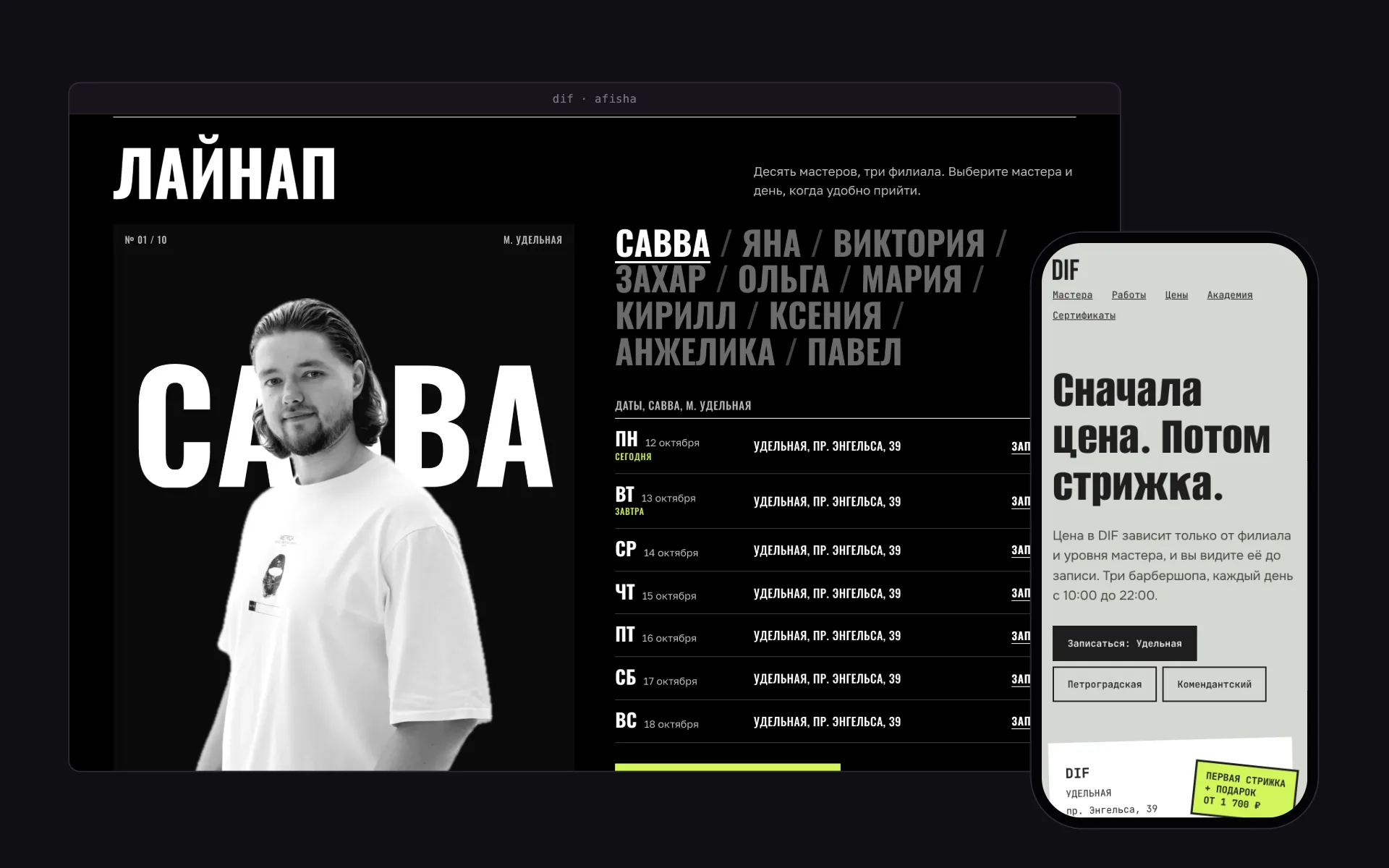
Every variant is built on one component library: Signboard, Poster, Ticket, Graphite, Acid and Flovant. The shared parts are the barber stage, a week of schedule in Moscow time, prices by barber level and a works gallery whose columns converge as you scroll.
The barber stage
The barber’s name runs across the full width of the screen, and the photo rises in front of the letters. The cut-outs were made from the old site’s round portraits with the macOS Vision foreground mask, with no manual masking. The stage has three framings, wide, medium and close, chosen per photo.
The result
On a phone the new home page is about 1.3 MB and 30 requests. Photos moved to WebP: 27 MB became 1.2 MB. On narrow screens the price list reflows with no horizontal scrolling.
How the barber stage works
A stage with a lift: behind a sign of letters, the barber’s cut-out stands in a slot. The crank is the page scroll: the further you go, the higher the cut-out rises, and the wings close the framing from wide to close.
Screens
Six variants of the first screen
Under the hood
- Six React 19, TypeScript and Vite projects sharing one component library.
- Barber cut-outs made with the macOS Vision mask from the old site’s round portraits.
- A schedule of the next 7 days in Moscow time; each row leads to that barber’s YCLIENTS booking.
- Scroll progress goes into a CSS variable, so the motion needs no heavy libraries.
- About 1.3 MB and 30 requests on a phone, against 3.1 MB and 121 requests for the old site.
React · TypeScript · Vite · macOS Vision · YCLIENTS